Soft Summer Mood Board No.2

Soft Summer Mood Board No.2
I absolutely love fashion magazines. Ever since I was a little girl, I was drawn to the glossy magazines. I have decided to create (at least) one mood board for each of the 12 Colour Types using cut-outs from recent fashion, lifestyle and beauty magazines. I want to capture the essence of each colour type using the latest fashion and trends. I want to show how each and every Colour Type can be modern, trendy, fashionable and chic, simply “in vogue”. Also, I want to create something using my hands away from the computer screen.
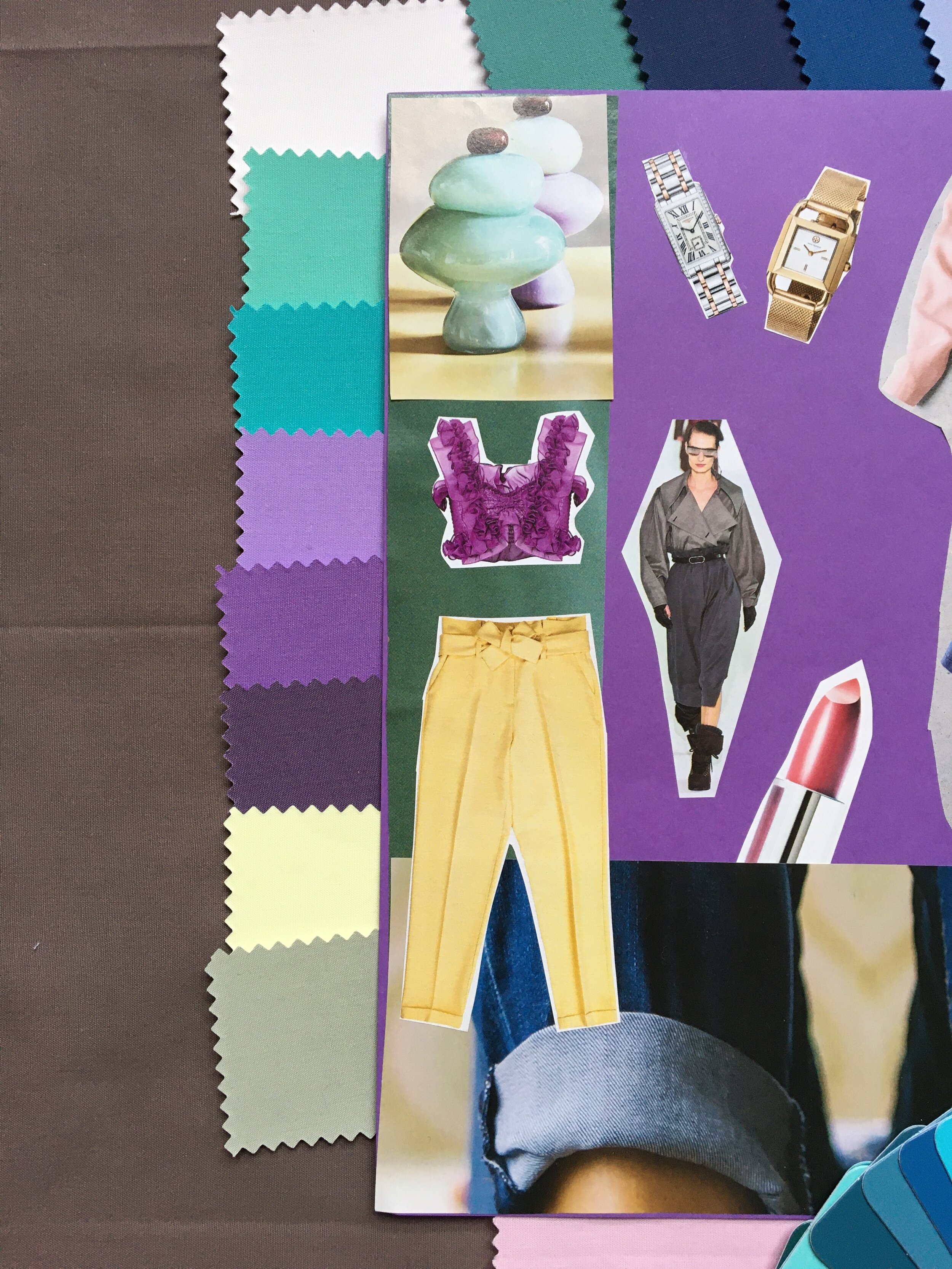
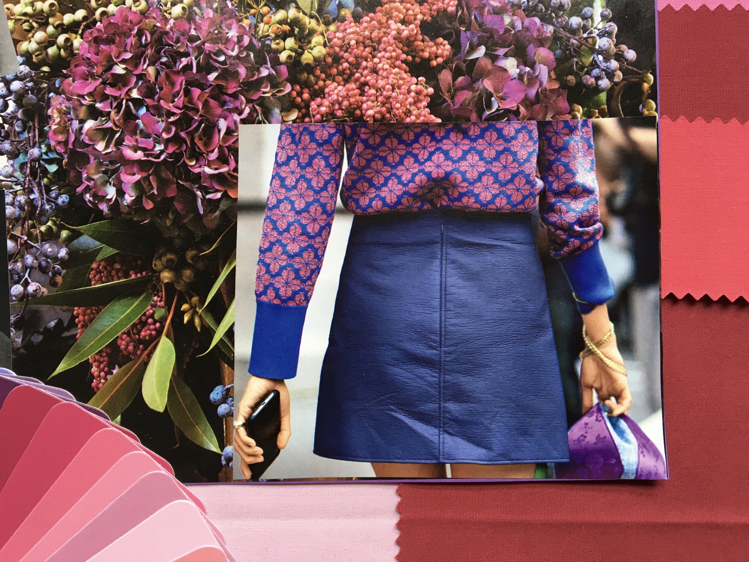
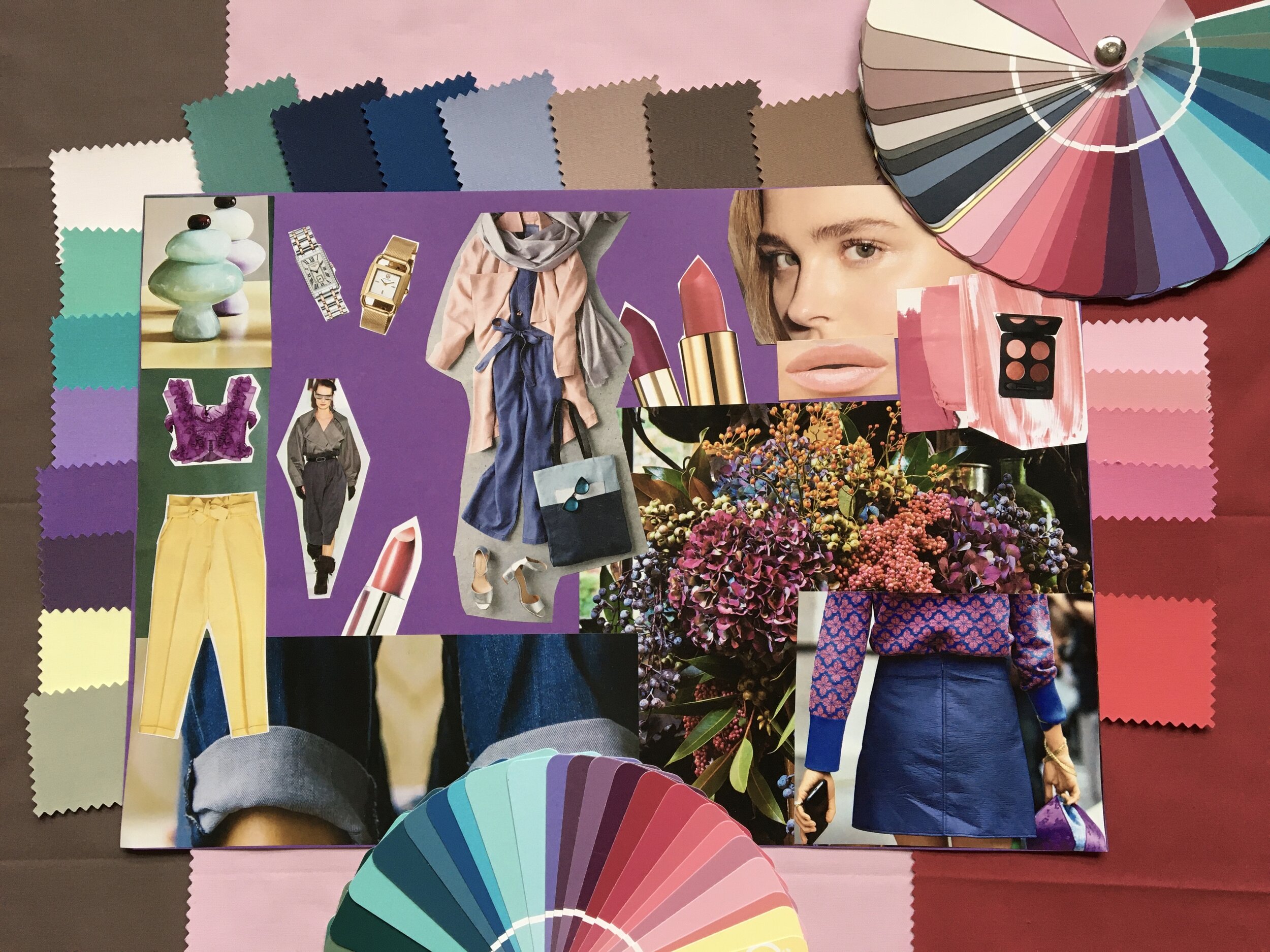
This is the second mood board dedicated to the Soft Summer Colour Type. It was very easy to find the cut-outs. There are currently plenty of options in the fashion and beauty industry that cater specifically to Soft Summers. Everything in the picture belongs to the Soft Summer colour palette. The cut-outs, the two colour fans (examples of fans that my clients receive during their PCA session), the colour of the paper (Soft Summer violet) as well as the colour of the background drapes.
At the first glance, the mood board should give you the overall feel for the Soft Summer colouring. Upon second and third viewing, you will be able to focus on the (hidden) details (the metals, lipstick colours, materials such as denim and linen, Soft Summer patterns, flowers and stones). In comparison to the Soft Summer mood board No.2, the first board featured more formal wear and shoes. However, this mood board focuses more on casual wear, materials and makeup colours.
Soft Summer Mood Board No.2 (Details)
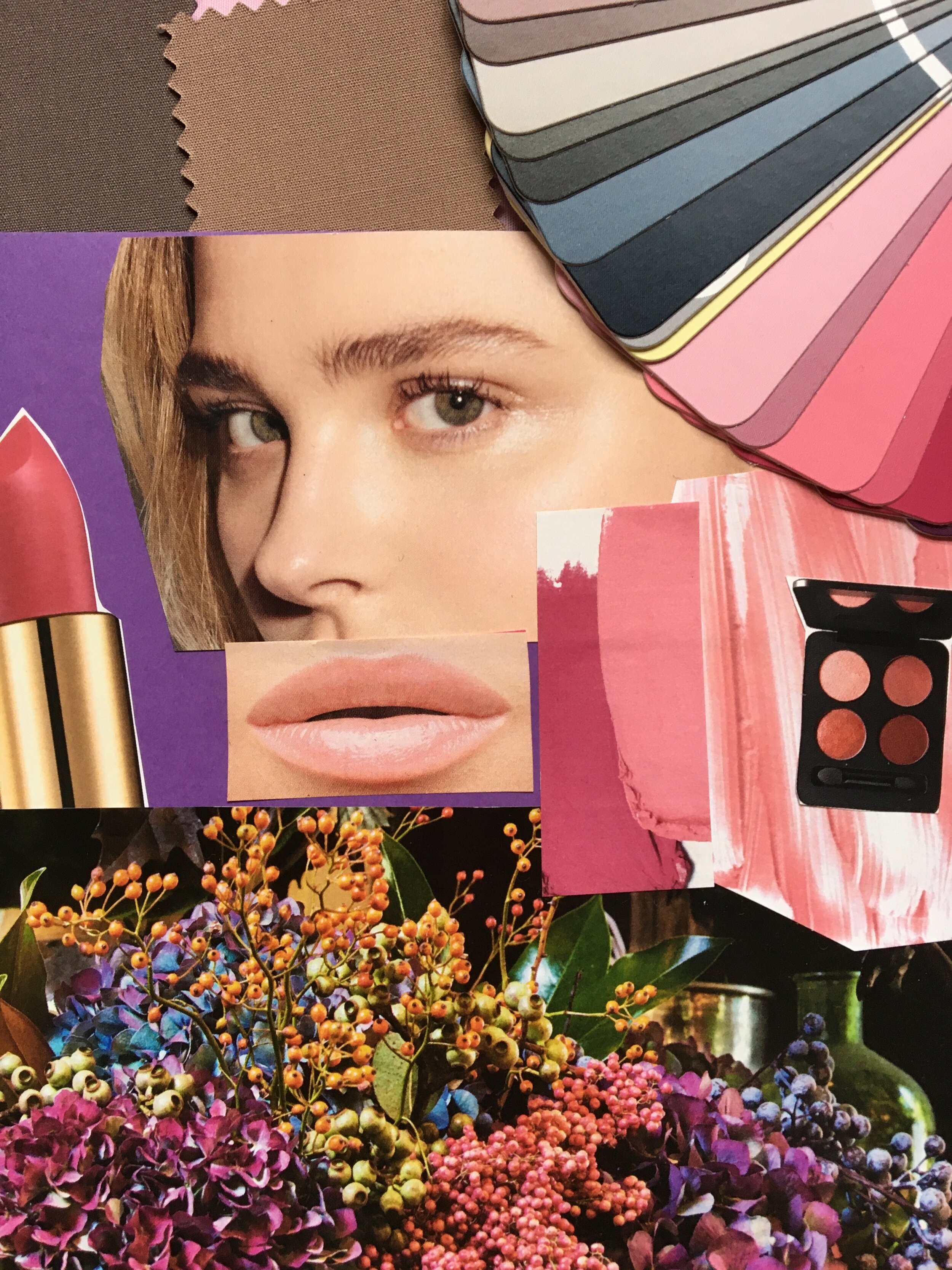
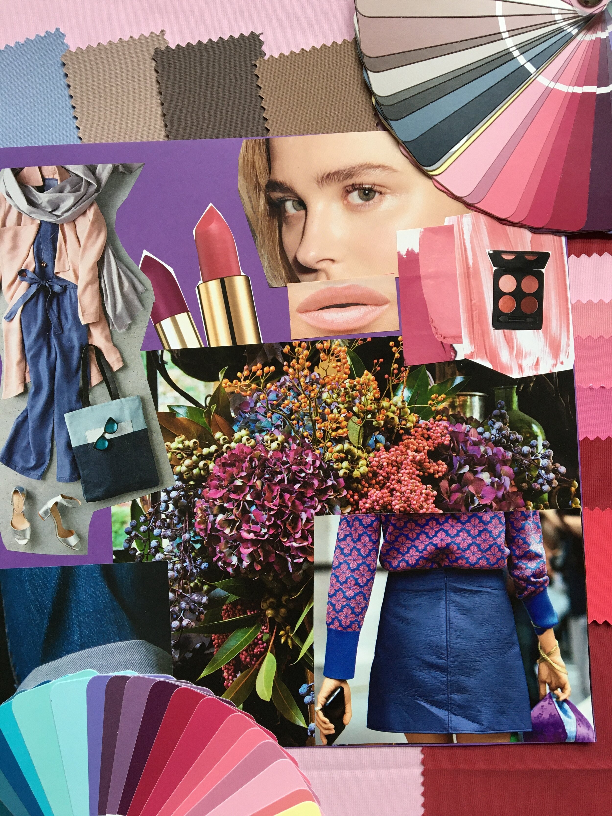
Do you recognise the famous actress in the top right corner? She is a Soft Summer, more precisely a Soft Summer Light. Do you know her name? You might find the answer in this article. Can you see how her face is in harmony with the colour fan and particularly with the makeup colours around her? You may ask, what does it mean: “in harmony”? It means that nothing clashes with her natural colouring. It means that the colours and textures around her complement her and make her stand out. Nothing overpowers nor undermines her natural beauty, nothing makes her natural colours read as “less than” or “lacking”. Her skin, eyes, hair and lips read as beautiful, understood, accepted and supported. Nothing tries to disrupt the harmony or make her feel inadequate: too light, too pale, too mousy, too plain… Every chosen harmonious colour says: “I am here to support your natural beauty, I will never make you feel less than. You are the number one here.”
Soft Summer colour palette is all about effortless elegance. No matter whether you dress formally or casually, there is something inherently elegant about the Soft Summer colours - elegant, delicate and perhaps slightly introverted. Grey blues meet soft teal, pastel blue green, antique white, mauve, ocean blue green, muted pink, light lemon yellow, taupe, turquoise, medium grey and ash of roses.

Soft Summer Mood Board No.2
Soft Summer Mood Board No.2
What do you think about the second Soft Summer mood board? Are there any Soft Summers reading this article? Do you know your best and worst colours and their combinations? Would Soft Summer colours suit you or are these the colours you should avoid? How about your best materials? Do you look better in materials that reflect or absorb light? Style Identity is here for you to find your optimal colour palette, your contrast levels, your best materials as well as your most flattering silhouettes. What Colour Type mood board should I do next? Please use the comment section below.
Note: This mood board is all about colour. It is not dedicated to any particular Image Archetype (Body Type).
Other Mood Boards: