Colours: Red
Linda: “What is personal colour analysis”?
Me: “It’s a colour draping process during which the client finds out what colours flatter her the most and what colours don’t suit her.”
Linda: “Oh, I know what colours suit me (giving me a knowing smile indicating PCA is not for her), I look really good in red!”
Me: “Well, there is a flattering shade of red for every person on the planet. Personal colour analysis helps you find YOUR best shade.”
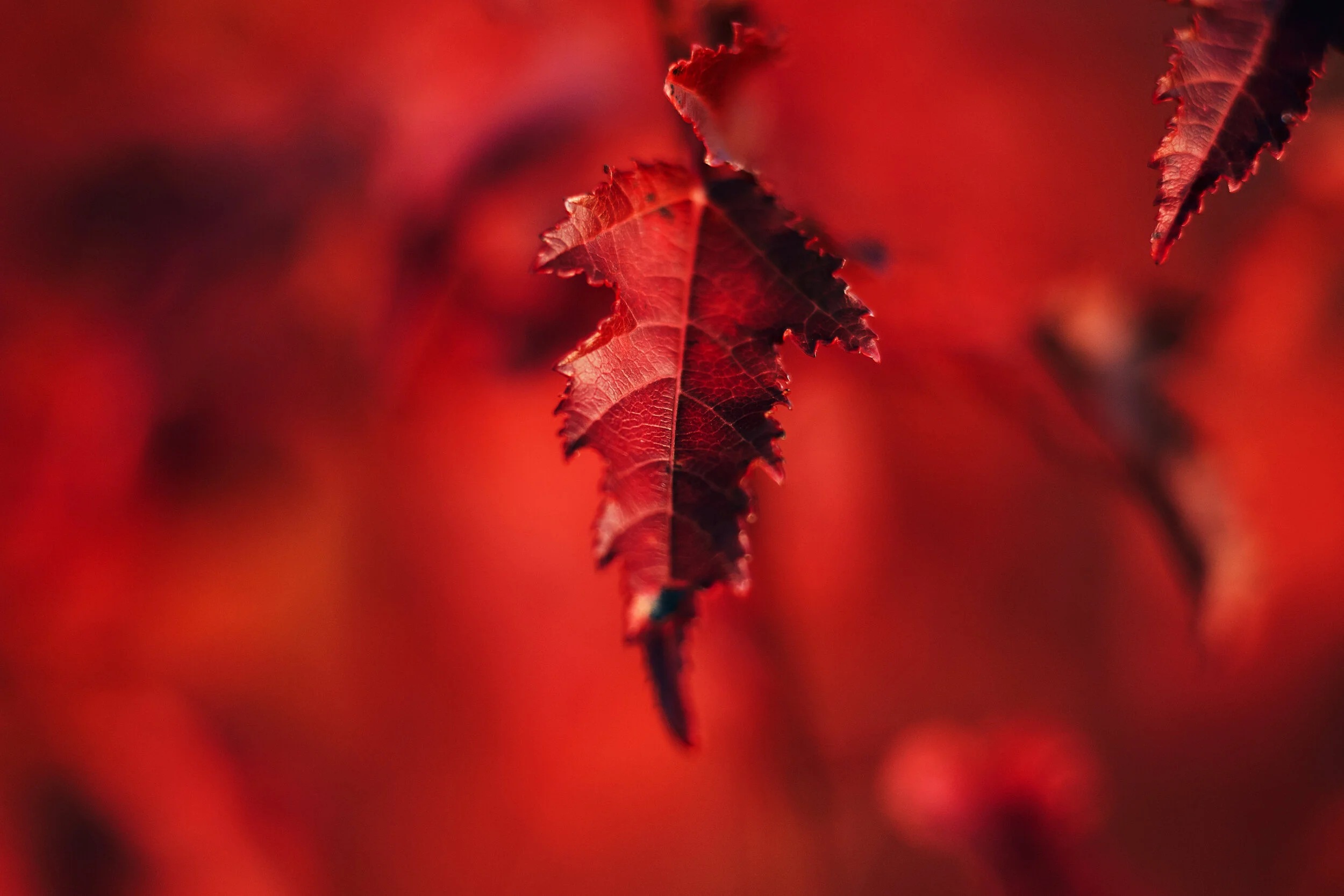
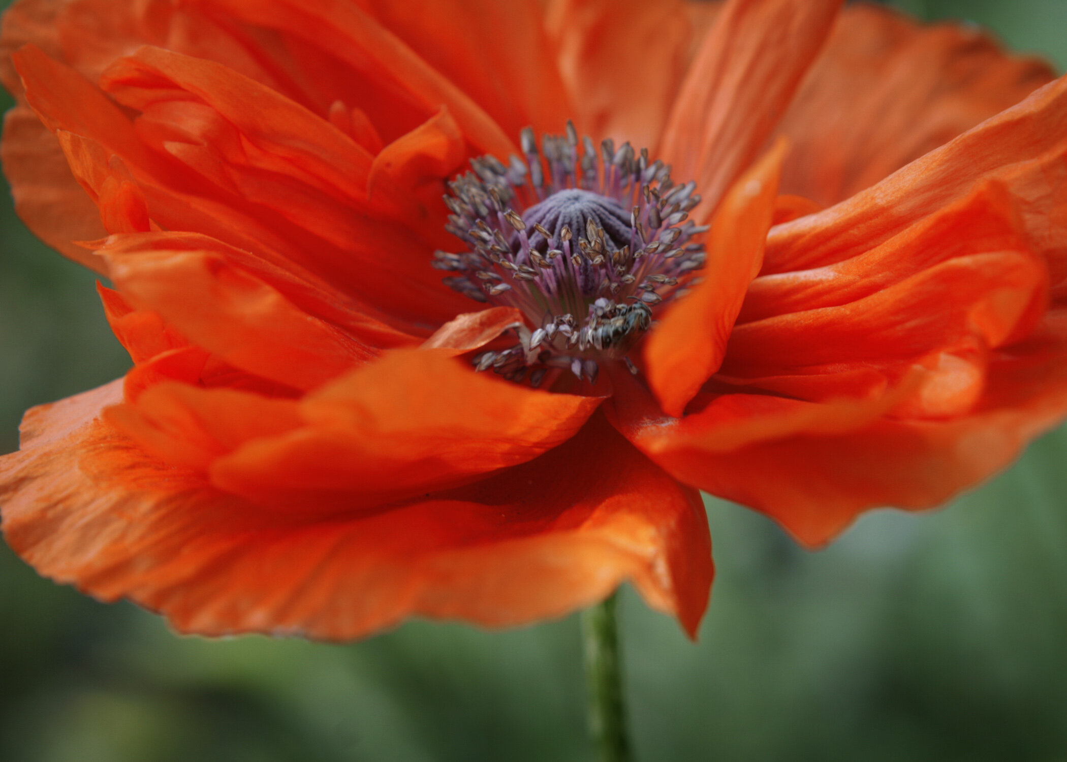
I’ve had a similar conversation several times over the past 2 years. It inspired me to create a series of articles dedicated to different shades of the same colour. Basically, no-one looks great in every shade of red. There is blue based red, yellow based red, brick red, bright red, orange red, deep red, tomato red, melon red, coral red, blood red, muted red, light red etc. In the “Colours” series, each article will focus on a different colour. The idea is to show a variety of shades of red (and blue, yellow, green, violet, orange etc.) and increase readers’ sensibility to the 3 dimensions of colour (hue, value and chroma). The more you see the differences between the different shades of the same colour, the more selective you will become when choosing colours that flatter your complexion, your eyes, your lips and your hair colour. With each photograph, I will indicate the Colour Type (i.e. the code name for a specific combination of the 3 colour dimensions) the shade belongs to.
Let’s start with red. Red is one of the three primary colours together with yellow and blue. We will examine the other primaries next time:-). The photographs are in no particular order.
Can you see what shades are warm (yellow based) and what shades are cool (blue based) and what shades are neutral (or neutral-cool or neutral-warm)? Can you see what shades are muted and what shades are bright? What shade of red suits YOU best? What shade of red suits your mum best?

Bright/Clear Winter

Deep/Dark Winter

Soft Autumn, Deep/Dark Autumn
Warm/True Autumn, Deep/Dark Autumn

All Autumns

Deep/Dark Autumn, Warm/True Autumn

All Summers

All Summers

Soft Summer, Light Summer

Cool/True Winter

Light Spring, (Warm/True Spring, Soft Autumn?)

All Springs

Warm/True Spring, Warm/True Autumn

Deep/Dark Autumn, Warm/True Autumn

Warm/True Spring

Light Summer

Soft Summer

Bright/Clear Winter

Deep/Dark Winter
Warm/True Spring, Bright/Clear Spring
This article is dedicated to my client G., who is a Bright/Clear Winter, because her absolute favourite colour is red. Not only does she look gorgeous in her red, the colour also suits her personality.