My Light Summer Client
Light Summer
E. was one of my very first clients. When I saw her, I though that she could be a Soft Summer or a Cool/True Summer. However, she turned out to be a Light Summer. If you want to learn more about her colour journey, keep reading.
At the beginning of her Personal Colour Analysis (PCA) session, E. told me that she read in a fashion magazine that blonde girls with blue eyes should not wear pink and baby blue, as it is too predictable. After that, she started wearing orange and brown and bronze colours. It turned out during the draping process that those were perhaps her absolute worst colours. It is therefore very important to never take any general suggestion in fashion magazines too seriously, as it may not apply to you. Many Colour Types (CTs) can be “blond” and all CTs can have blue eyes or a dash of blue in their eyes. Perhaps the “tip” she read would be applicable to Soft Autumns with blue-green eyes and caramel (= a version of blond) hair, but not to her…
E. was looking for guidelines that would help her look like her: authentic, healthy and competent. In the pre-session questionnaire she stated that her family likes her in light colours such as lilac, light violet and light blue. She dislikes colours that are washed out (=too muted) and likes to colour her hair brown or ginger.
While I like to guesstimate people's s CTs, it is what it is, a guesstimate. Nothing more and nothing else. The truth is only revealed by the draping process. The professional analyst drapes are precise mathematical tools; they are constants that enable us to bring order into colour analysis and determine colour harmony through measuring the 3 colour dimensions of client's face, i.e. hue, vale and chroma.

Light Summer
The draping process revealed that warm, yellow based and golden colours are less suitable for her complexion. Cooler, blue based, silvery colours were much better, she seemed more alive. In very warm and especially deep colours her face turned unhealthy yellow brown, her eye whites turned beige, her eyes lost their spark and her skin looked patchy and very unhealthy. We joked that if she wore her worst colours to see the doctor, he would just look at her, give her a sick leave and send her home to rest. We also saw in the mirror that deep colours, no matter whether cool or warm, covered the lower part of the face with a dark shade and almost swallowed it. She looked lost in deep neutral aubergine and burgundy, deep emerald green and deep chocolate brown. As if she were not in the room.
Lighter colours were much more flattering to her skin tone, didn't compete with her and let her shine. Still there was a way to go before we could take any conclusions. Light, bright and slightly warm colours were too bright and warm for her, yet some of the teals were not that bad. Light, cool and muted colours were quite good, however, not all of them were her best. Soft Summer colours were surprisingly unflattering next to her face, as the slight Autumn influence was way too apparent on E. and the muteness in chroma dragged her face down, swell her chin and made the skin appear patchy and grey, simply unhealthy. Finally it became clear that her best colours as well as the colour dimensions of her face were medium cool to cool, light in value and neutral to slightly soft in chroma aka Light Summer. E.’s second best Season is Cool/True Summer, from which she can borrow some shades of colours occasionally.
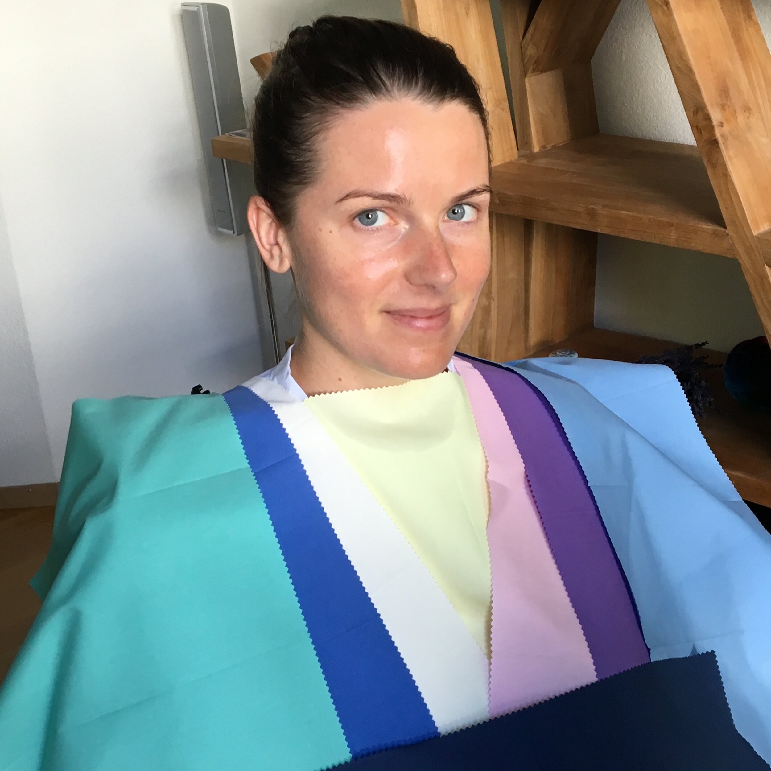
She was excited to see that her and her family’s favourite colours such as light blue and light violet as well as light pink are among her best colours. She has plenty of blues and pastels to choose from. She looked carefully at her neutrals too so that she can build a professional wardrobe with confidence and ease.

E. in her Light Summer colours. Here she still wears the head scarf we used during the draping process to cover her hair dye.
E. might have resembled some celebrities that are considered to be Soft or Cool/True Summers, yet, she was clearly and without any doubt a Light Summer. That is why we should take any guesstimates, even of the best colour analysts, carefully and keep a certain level of scepticism. Unless a person, e.g. a celebrity, sat in my chair and I measured his/her colour dimensions using drapes, I can never be 100% sure of his/her CT.
E. chose to take home a colour fan that has a size of a business card as she wants to always carry her best colours in her wallet.
During the theory and training part of the PCA sessions we looked at beautiful photographs that represent Light Summer harmony, in depth know how about her CT, shopping tips, her ideal metals, jewellery, materials, famous persons who share her CT, makeup colours, her secret Light Summer Pinterest board with practical examples of wardrobe options (formal to casual including makeup and accessories), and so much more. We discussed hair in depth as she had an orange/red hair colour at the time that would be suitable for an Autumn CT but not for her. We discussed that she could grow her natural hair and we also looked at hair dye options for her. She decided to grow out her natural hair colour and get rid of the unflattering shade of warm red-orange over time. E. knows that the closer she puts an unflattering colour to her face, the higher the penalty to her skin. Hair colour is basically nonstop around the face. Thus it is - together with makeup colours - the most important colour that should be in harmony with E.’s natural pigments.
We also defined E.’s personal value and hue contrast levels which help her decide how to combine colours. Her value contrast is low: 3 & 5,5 (3 - lightest and 5,5 - deepest) and her ideal hue contrast is 90° or 120°. She learned how to combine colours in terms of difference in value as well as the optimal distance of colours on the colour wheel that looks most authentic on her. She also knows what hue and value contrast levels to avoid and why. We looked into how to enhance her beautiful blue-green and yellow eyes using colours from her colour palette, how to add healthy colour to her cheeks with the right top, how to use her colour fan in shops as well as how to incorporate less ideal colours into her outfits and make the most of colour psychology. E. is a young professional that dresses business casual most of the time and builds her wardrobe accordingly. She often gives speeches on stage. Therefore, insights into her best colours as well as colour psychology will help her capture her audience’s attention as well as give her the confidence and peace of mind that she looks her best.
E. loves her colour palette and is proud to wear her authentic colours that she’s instinctively always loved. She is over her Autumn palette phase and back to her true self, her true Colour Identity.

What is more, shortly after she discovered her CT, she took her newly acquired know-how to the next level. She used her best colours for the cover of her book! This is authenticity and marketing taken to the next level! Well done! The authenticity of the book cover matches the authentic, captivating and “far from the shallow” content of E.’s words, thoughts, impressions and poetry of life, love… moments that are sometimes sweet, sometimes bitter and sometimes a bit of both.
It is not only about the colour of your clothes and makeup. Create a personal brand wherever you go and use the colours from your colour palette on you CV, website, logo, book cover, interior design, merchandise etc.